Visualization
Visualization - [plotly library]
_data
2022. 12. 18. 11:10

matplotlib보다 더욱 직관적이고, 분석하는데에 용이하다. 마우스 커서로 값들을 볼 수 있는 장점이 있다.
코드는 복잡하니 외우지말고 스크랩해서 수정하면 된다.
plotly library
import pandas as pd
import numpy as np
import matplotlib as mpl

from plotly.offline import import init_notebook_mode, iplot, plot
import plotly as py
init_notebook_mode(connected=True)
import plotly.graph_objs as go

from wordcloud import WordCloud
Line Plot
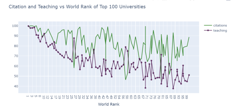
# prepare data frame
df = timesData.iloc[:100,:]

# Creating trace1
trace1 = go.Scatter(
                    x = df.world_rank,
                    y = df.citations,
                    mode = "lines",
                    name = "citations",
                    marker = dict(color = 'rgba(16, 112, 2, 0.8)'),
                    text= df.university_name)
# Creating trace2
trace2 = go.Scatter(
                    x = df.world_rank,
                    y = df.teaching,
                    mode = "lines+markers",
                    name = "teaching",
                    marker = dict(color = 'rgba(80, 26, 80, 0.8)'),
                    text= df.university_name)

data = [trace1, trace2]

layout = dict(title = 'Citation and Teaching vs World Rank of Top 100 Universities',
              xaxis= dict(title= 'World Rank',ticklen= 5,zeroline= False)
             )

fig = dict(data = data, layout = layout)
iplot(fig)
Scatter Plot
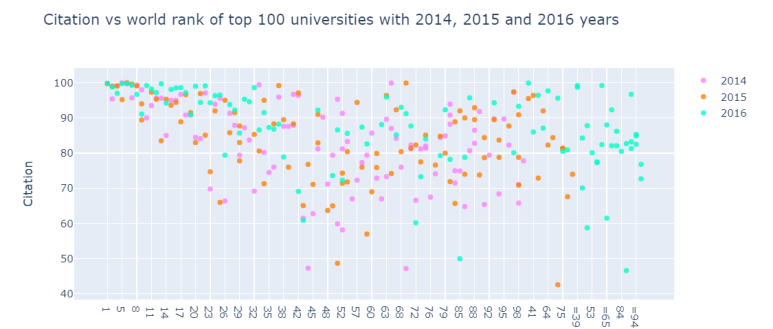
# prepare data frames
df2014 = timesData[timesData.year == 2014].iloc[:100,:]
df2015 = timesData[timesData.year == 2015].iloc[:100,:]
df2016 = timesData[timesData.year == 2016].iloc[:100,:]

# creating trace1
trace1 =go.Scatter(
                    x = df2014.world_rank,
                    y = df2014.citations,
                    mode = "markers",
                    name = "2014",
                    marker = dict(color = 'rgba(255, 128, 255, 0.8)'),
                    text= df2014.university_name)
# creating trace2
trace2 =go.Scatter(
                    x = df2015.world_rank,
                    y = df2015.citations,
                    mode = "markers",
                    name = "2015",
                    marker = dict(color = 'rgba(255, 128, 2, 0.8)'),
                    text= df2015.university_name)
# creating trace3
trace3 =go.Scatter(
                    x = df2016.world_rank,
                    y = df2016.citations,
                    mode = "markers",
                    name = "2016",
                    marker = dict(color = 'rgba(0, 255, 200, 0.8)'),
                    text= df2016.university_name)

data = [trace1, trace2, trace3]

layout = dict(title = 'Citation vs world rank of top 100 universities with 2014, 2015 and 2016 years',
              xaxis= dict(title= 'World Rank',ticklen= 5,zeroline= False),
              yaxis= dict(title= 'Citation',ticklen= 5,zeroline= False)
             )

fig = dict(data = data, layout = layout)
iplot(fig)
Bar Chart
df2014 = timesData[timesData.year == 2014].iloc[:3, :]

#create trace1
trace1 = go.Bar(
                x = df2014.university_name,
                y = df2014.citations,
                name = "citations",
                marker = dict(color = 'rgba(255, 174, 255, 0.5)',
                             line=dict(color='rgb(0,0,0)',width=1.5)),
                text = df2014.country)
# create trace2
trace2 = go.Bar(
                x = df2014.university_name,
                y = df2014.teaching,
                name = "teaching",
                marker = dict(color = 'rgba(255, 255, 128, 0.5)',
                              line=dict(color='rgb(0,0,0)',width=1.5)),
                text = df2014.country)

data = [trace1, trace2]

#group mode
layout= go.Layout(barmode='group')
fig=go.Figure(data= data, layout=layout)
iplot(fig)
Bar Chart 2
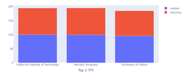
x= df2014.university_name

trace1= {
    'x':x,
    'y': df2014.citations,
    'name':'citation',
    'type':'bar'
}

trace2 = {
    'x':x,
    'y':df2014.teaching,
    'name':'teaching',
    'type':'bar'
}

data= [trace1, trace2]

layout= {
    'xaxis':{'title':'Top 3 대학'},
    'barmode':'relative',
    'title':'citations and teacing of top 3 universities in 2014'
}

fig = go. Figure(data=data, layout=layout)
iplot(fig)
Pie Chart
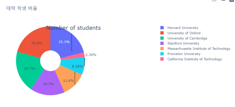
df2016 = timesData[timesData.year==2016].iloc[:7,:]

#값에 2243이 있는데 2,243으로 표기됨. 바꾸어주어야 함.
pie1 = df2016.num_students
pie1_list = [float(each.replace(',','.')) for each in df2016.num_students]
labels = df2016.university_name

#data, layout
fig = {
    'data':[
        {
            'values':pie1_list,
            'labels':labels,
            'domain':{'x':[0, .5]},
            'name':'num of students rates',
            'hoverinfo':'label+percent+name',
            'hole':.3,
            'type':'pie'
        },
    ],
    'layout': {
        'title':'대학 학생 비율',
        'annotations':[
            {
                'font':{'size':20},
                'showarrow':False,
                'text': ' Number of students',
                'x':0.20,
                'y':1

            },
        ]
    }
}

iplot(fig)
Histogram
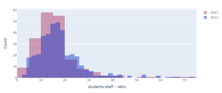
x2011 = timesData.student_staff_ratio[timesData.year==2011]
x2012 = timesData.student_staff_ratio[timesData.year == 2012]

#create trace1
trace1 = go.Histogram(x=x2011,
                     opacity= .75,
                     name='2011',
                     marker=dict(color= 'rgba(171,50,96, .6)'))

#create trace2
trace2 = go.Histogram(x= x2012,
                     opacity=.75,
                     name='2012',
                     marker=dict(color='rgba(12,50,196, .6)'))

data=[trace1, trace2]

layout= go.Layout(barmode='overlay',
                 title='',
                 xaxis=dict(title='students-staff - ratio'),
                 yaxis=dict(title='Count'))

fig= go.Figure(data=data, layout=layout)
iplot(fig)
Word Cloud
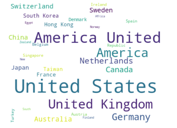
import matplotlib.pyplot as plt
plt.subplots(figsize=(8,8))

x2012= timesData.country[timesData.year==2011]

wordcloud=WordCloud(
    background_color='white',
    width=512,
    height=384).generate(" ".join(x2011))

plt.imshow(wordcloud)
plt.axis('off')
plt.savefig('graph.png')
plt.show()
reference : https://www.kaggle.com/kanncaa1/plotly-tutorial-for-beginners/